Human errors are any actions users take that result in unintended outcomes or a failure to achieve a desired goal. Human error can occur due to slips, mistakes, or lapses. If designers consider human factors in interaction design, they can create more user-friendly and error-tolerant interfaces.
Why is Human Error such a Big Problem for Design?
One of the primary goals of user experience (UX) designers’ work is to create products that are intuitive and error-free. However, despite designers’ best intentions, human errors can still happen when users interact with interfaces. These errors are often due to bad design choices that do not account for the limitations and behaviors of real users. And they can wreck the overall user experience, if not produce an even worse effect.
To err is human. Fortunately, you, as a designer, can minimize the chances that users will become frustrated with your product. Start by remembering that it’s easy to make the error of assuming your users won’t make mistakes. Human error, in a UX design context, refers to actions or decisions made by users that result in unintended or undesired outcomes. These errors can occur at various stages of the user's interaction with a product. That includes their initial understanding of the interface to the execution of their tasks. Errors can lead to frustration, loss of productivity, and even potential harm. So, it’s important to understand the types of errors and determine how to stay ahead of where your users might go wrong, and design to keep them on the right track.
As a designer, you have to factor in the potential for human error. You can’t take the “user” out of the user experience.
© Emanuel Serbanoiu, Fair Use
Types of Human Errors
According to Don Norman, renowned expert in UX design, human errors come in two categories:
Slips – Slips occur when you don’t mean to do something. It could be because you’re just going too fast with the swipes or selecting items to delete, for example. Like slips in the physical world, users are likely to stumble in the digital world. These are the kinds of errors that can happen to us all. However, you can aim ahead to help users minimize these as far as possible.
Mistakes – Mistakes are intentional errors. However, they don’t occur because users want to sabotage their tasks or goals. Mistakes happen when a user has developed an incorrect mental model of the interface and forms a goal that doesn't suit the situation well. These errors are, therefore, intended actions, but they’re actions that aren’t appropriate for the problem at hand. They come from a misunderstanding of the system's state. Or it could be that the user has a poor interpretation of the interface. A classic example is a Norman door—for instance, a door with a pullable-looking handle, but users can only push the door to open it. As a designer, you can help users prevent mistakes by giving them an accurate idea of what to do through an intuitive interface, for example.
In addition to these, a third category of human error is:
Lapses – Lapses tend to happen when a user's attention is not focused on the task at hand. These errors are usually caused by distractions, fatigue, or being on “autopilot” mode. They are much like slips, but involve failing to stick to an original plan you had intended to follow. This could be forgetting to do something you had meant to do, or taking an action you hadn’t initially planned to execute.
Lapses are often more difficult to anticipate and prevent than slips and mistakes. That’s because users may not always be aware of their lack of focus. An example of a lapse is forgetting to log into a website to update your account information. So, you might help minimize this problem by giving users a reminder to do some needed or recommended action, for instance.

User errors can arise very easily, and aren’t always about a fundamental failure to understand a concept.
© George Becker, CC BY-SA 4.0
As a designer, it is important to remember the potential for slips, lapses and mistakes in user behavior from the beginning of your design process. Also, it’s vital to try to minimize these through the design choices you make along the way, while still allowing your users some flexibility on your interface.
The Impact of Bad Design on Human Errors
Here are some common examples of how bad designs can influence human errors:
Lack of Clear Directional Cues
Directional cues play a crucial role in guiding users. They guide users through an interface and help them understand how to interact with different elements. When a design lacks clear directional cues, users may struggle to navigate the interface and end up making errors. For example, a website may fail to provide clear visual indicators for clickable elements. So, users may click on the wrong areas or miss important actions, leading to errors.

Amazon’s site has a handy “safeguard” to keep users on the right track – search suggestions that are also clickable are great aids for users.
© Amazon, Fair Use
Confusing or Ambiguous Error Messages
Error messages are essential for informing users about issues or mistakes they've made while using a product. However, when error messages are confusing or ambiguous, users may not understand the problem or how to correct it. This can lead to frustration and further errors. It’s important to provide clear and informative error messages that guide users towards resolving the issue.
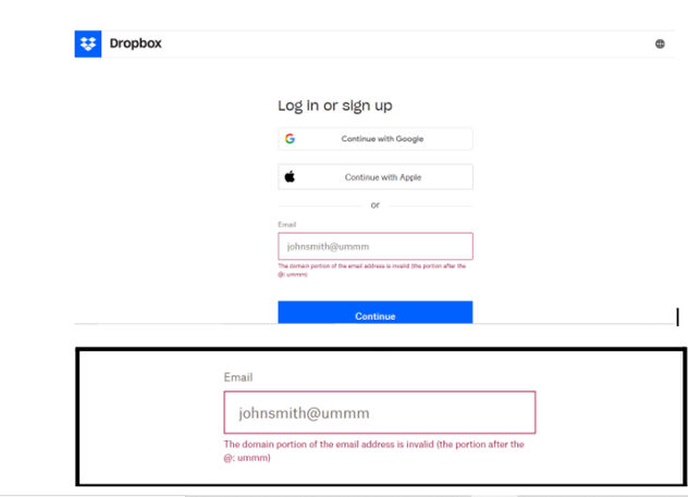
Dropbox tells users precisely where they’ve gone wrong in clear and unambiguous terms.
© Dropbox, Fair Use
Complex or Overwhelming Interfaces
Complex or overwhelming interfaces can “throw” users and greatly increase the likelihood they’ll make errors. Sometimes, users encounter too many elements, options, or features on the screen. Then, they may struggle to find what they need or execute the correct actions. Indeed, human errors can arise from the design of a complex or overwhelming interface, and all too easily. With risks to human life and property running sky-high in more severe cases, it’s an important point to remember also for hand-held devices. Despite the differences in potential—that is, loss of life and limb and destruction of property versus a user’s failing to use an app correctly—designers should consider one thing in particular: for users, nothing is “trivial” when they are serious about a product or service.
Here, Don Norman recounts his work with complex systems, their users, as well as a notable and costly disaster, before he explains the principles of human-centered design from his experience with people and systems.
However, when you simplify the interface and prioritize essential elements, you can help users focus on their tasks and reduce the occurrence of errors.
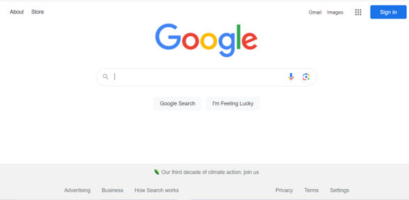
Google’s homepage is a definitive example of a simple and highly effective user interface. Thanks to a thoughtful layout, featuring generous use of white space, the chances that a user becomes overwhelmed are practically nonexistent.
© Google, Fair Use
Lack of Feedback and Confirmation
Feedback is crucial in helping users understand the outcome of their actions and confirming that they have completed tasks successfully. A design may lack proper feedback mechanisms or fail to provide confirmation for critical actions. Therefore, users may be uncertain about the results of their interactions, leading to errors. Incorporating visual cues, notifications, or confirmation dialogs can help reduce ambiguity and improve user confidence.
Windows offers feedback to users in no uncertain terms regarding what may happen next.
© Microsoft, Fair Use
How to Design to Minimize Human Errors
Here are some practical approaches to minimize human errors and create user-friendly experiences:
1. Prioritize Clarity and Simplicity
Clear and simple designs can significantly reduce the frequency of human errors. This is why it’s important to know and leverage design principles. So, when you prioritize clarity in visual elements, content presentation, and navigation, you can ensure that users understand the interface. From there, they can easily execute tasks without confusion or mistakes. Use clear labels, intuitive icons, and logical grouping of elements to guide users effectively.
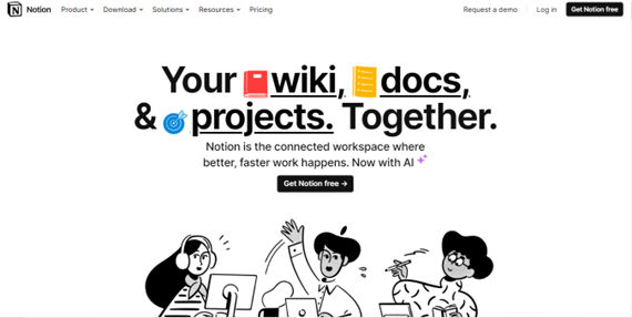
Notion presents fine clarity on its homepage in a clean, clearly labeled and attractively presented way.
© Notion, Fair Use
2. Provide Visual Cues and Affordances
Visual cues and affordances help users understand how to interact with different elements in an interface. It’s important to utilize consistent and recognizable visual cues, such as buttons, icons, or hover effects. That way, you can provide clear indications of functionality and reduce the chances of user errors. Affordances, such as buttons that appear clickable or toggles that indicate on/off states, help users understand the available actions. And so, they prevent unintended errors.
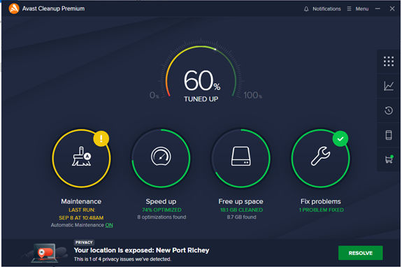
Avast Cleanup offers clear affordances and cues to keep users informed and clued up at a glance about available actions.
© Avast, Fair Use
3. Disallow Inappropriate Actions
Keep users on the right track by keeping them away from the wrong ones. For example, a radio button only allows users one course of action at a time. Or frozen or grayed-out buttons or fields show them they need to focus on the proper or “live” ones. A classic real-world example is booking airline tickets or accommodation.
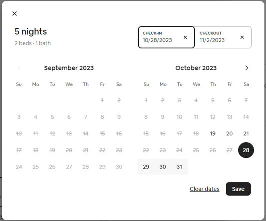
Airbnb’s website applies the convention of graying out dates to let you know you can’t select dates in the past or unavailable dates for a booking.
© Airbnb, Fair Use
4. Offer Real-Time Feedback and Validation
Real-time feedback and validation play a crucial role in preventing errors. By providing immediate feedback when users perform actions or input data, you can help them catch and correct errors early. For example, displaying error messages next to problematic form fields or highlighting missing information can guide users toward resolving errors promptly.
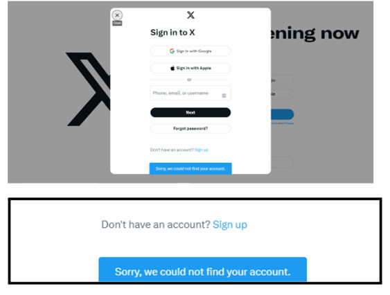
X Corp.’s message alerts a user that their account is unfindable – perhaps due to a mistype in the login field.
© X Corp., Fair Use
5. Consider User Context and Mental Models
Always consider the user's context and mental models when creating interfaces. Do UX research and keep to user-centered design. By understanding the users' goals, expectations and prior knowledge, you can align the interface design with users' mental models. That will reduce the chances of errors caused by mismatches between user expectations and the interface behavior.
For example, if your app uses GPS to direct users to services, leverage their mental model of using a traditional paper map. Some mental models are easier to apply than others, but if you do your user research well, you can inform design decisions that will work well.

Airbnb draws on users’ mental model of booking a hotel room or vacation rental, keeping to a similar process of searching, comparing listings and booking.
© Airbnb, Fair Use
6. Create a Clear and Consistent Visual Hierarchy
A clear and consistent visual hierarchy helps users understand the importance and relationships between different elements on the interface. By using visual cues such as size, color, and placement, you can guide users' attention to critical elements. That will reduce the risk of errors caused by overlooking important information.

Mailchimp uses color, size, white space, and contrast in its homepage, which features highly distinguishable elements. Users have clear guides to key actions.
© Mailchimp, Fair Use
7. Provide Simplified and Streamlined Interactions
Complex and convoluted interactions increase the likelihood of user errors. Strive to simplify and streamline interactions. That will reduce the cognitive load on users. And it will make it easier for them to accomplish their goals without confusion or frustration.

Uber’s ride-booking process is ultra-streamlined for users who land on the homepage (top screenshot in image above) to proceed to the next easy step (bottom).
© Uber, Fair Use
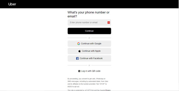
© Uber, Fair Use
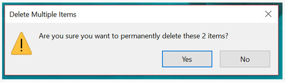
8. Help Prevent Irreversible Actions
Incorporate safety measures to prevent users from accidentally committing to irreversible actions. Implement confirmation dialogs and provide clear warnings before executing irreversible actions. These can help users avoid errors and the resulting consequences and pain points. For example, Windows asks users if they’re sure they want to permanently delete items before they commit to the action of, for example, emptying their PC’s trash can.
9. Conduct User Testing and Do Iterative Design
Conduct user testing sessions and gather feedback throughout the design process. It is crucial for identifying potential sources of human error. Usability testing can weed out users’ problems with the information architecture and many other aspects of user interface (UI) design. So, for testing user interfaces effectively, be sure to recruit participants in your UX design process and product development who can give you the user feedback you need. Variety is key for finding out much about what can go wrong. Whether it’s accessibility-related or something perhaps more intricate, when you involve users in the design process, you can gain valuable insights and iterate on your designs. You can then improve usability and minimize human errors.
Remember, human errors can often be attributed to bad design choices that misunderstand user flow. So, understand the various types of human errors and the impact of bad design on those errors. And implement effective design strategies that always stay one step ahead of your target audience at every point on their customer journey. Doing so, you can put the user on the right path every time, and help them minimize errors—or even avoid errors—when using your products.


#/media/File:Ed_lines.jpg)