Affordances are the characteristics or properties of an object that suggest how it can be used. It shows a user that an object can be interacted with.
As such, an affordance is not a “property” of an object (like a physical object or a User Interface). Instead, an affordance is defined in the relation between the user and the object: A door affords opening if you can reach the handle. For a toddler, the door does not afford opening if she cannot reach the handle.
An affordance is, in essence, an action possibility in the relation between user and an object.
Sounds complex? Good news, we made a few videos for you with some examples to make it easy for you to understand.
Learn what affordances are through examples and see why affordances are key to users’ desired actions.
“When affordances are taken advantage of, the user knows what to do just by looking: no picture, label, or instruction needed.”
— Don Norman, Grand Old Man of User Experience
Affordances are Everywhere
Psychologist James Gibson coined “affordance” in 1977, referring to all action possibilities with an object based on users’ physical capabilities. For instance, a chair affords sitting on, standing on, throwing, etc.
Don Norman later (1988) introduced the term to the design community modified the meaning slightly to make it more appropriate for use by designers. For example, Don Norman defined affordances as perceivable action possibilities – i.e., only actions which users consider possible. So, designers must create objects’ affordances to conform to users’ needs based on these users’ physical and perceptual capabilities, goals and past experiences. Clear affordances are vital to usability. Users will map the possibilities of what an object does according to their conceptual model of what that object should do (e.g., inserting fingers into scissor holes to cut things).
Signifiers and affordances
Don Norman also introduced the term “signifier”, which is elaborated greatly in his 2013 edition of The Design of Everyday Things.
Learn about signifiers and the critical role they play in design.
A "signifier" is some sort of perceivable cue about the affordance. Don Norman introduced the term to make a clear distinction between the signal an affordance might provide to a person, which is entirely in the perceptible part of an affordance, and the actual affordance itself. Signifiers can exist on their own. Just as affordances can exist without any signifier - the signifier part of an affordance may be invisible (or misleading).
Explore how you can make invisible affordances visible.
The reason Don Norman introduced the term “signifier” was that many people were misusing the concept of affordance after it had been introduced to the design community in the 1988 edition of The Design of Everyday Things. By introducing the distinction between signifier and affordance into two more distinct components, it became clear that much of design has nothing to do with affordances, but with signifiers.
Learn more about the differences between affordances, perceived affordances and signifiers.
For example, a painted zebra stripe in the side of a road is a signifier, a signal about where to walk. It is telling you where it is safe to walk. However, you can walk anywhere on the road - there are no affordances stopping you. A fence by the side of the road would stop you since it has a physical affordance. Unless you are able to climb over the fence, of course.
More elaborations on affordances
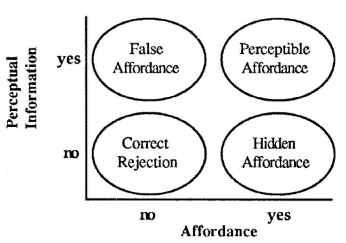
In 1991, William Gaver, another notable designer, defined three types of affordances:
Perceptible – Perceptual characteristics of the object itself indicate what action possibilities are available and desired – e.g., a door handle. These obvious properties prompt users to use the affordance in an intended way.
Hidden – In user interfaces without obvious affordances, users often must rely on experience and/or trial and error to determine possible actions – e.g., they hover/click on suspected drop-down menus.
False – An object’s characteristics suggest users can do something they can’t – e.g., underlined text that isn’t a link.
In 2001, Human-computer interaction (HCI) expert Rex Hartson defined four additional types:
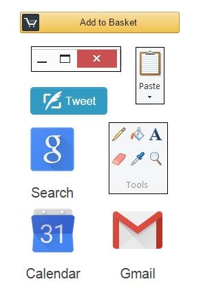
Physical – The perceptual characteristics show users what to do – e.g., a large, highly visible “Add to cart” button. (Whenever text appears on affordances such as buttons, they’re called explicit affordances.)
Cognitive –Design features that help users notice or know about things – e.g., clearly labelled text to announce what will happen if users press a certain key.
Sensory – Design features that help users sense something – e.g., clear “pinging” feedback to indicate an available update.
Functional – Design features that help users achieve goals – e.g., an item appears in a shopping cart after a user clicks “Add to cart”.
In user interface (UI) design, other main affordances include:
Pattern – You follow conventions to prompt users to take actions – e.g., hamburger icons indicate menus.
Negative – You block users from proceeding towards a goal when they must provide more data – e.g., a greyed-out “Create account” button remains until users complete the form.

The Interaction Design Foundation homepage is loaded with affordances – e.g., the shadows and the shape make the blue rectangles stand out as buttons.
How to Design the Best Affordances
You want to minimize or prevent user errors and cognitive friction. User errors occur when users fail to map between the actions they perceive they can take with an object and the actions it allows. Cognitive friction results from unexpected system actions after a user attempts a task. So, correct clues and immediate, effective feedback are essential. You should:
Understand your users best through UX research – especially how they’ll anticipate affordances in the unique settings/context of encountering your design. Leverage these insights to provide the best clues to users, who will expect to find obvious cues to perform tasks.
Use design principles to create logically arranged, clear affordances without clutter – so users can intuit what functions of your graphic user interface (GUI) each affordance controls.
Use signifiers to direct users to affordances – Wherever you can’t make affordances obvious due to color constraints, etc., mark the affordance (e.g., highlight, shadow) or write text on or near it to guide users as to what they should do.
Follow conventions so users recognize affordances – E.g., “Search” in search boxes.
Apply Fitts’ Law to help guide users’ judgments and actions – Since this law establishes that users make more mistakes when moving quickly at smaller targets that are farther apart, help users by (e.g.) making large command buttons to show them priorities.
Exploit Material Design – With Google’s Android-oriented design language, you can leverage cue-rich features and natural motions to support onscreen touch experiences. Customize icons to meet users’ expectations best as you present your brand.
If designing for augmented reality or virtual reality, you have the advantage of reflecting real-world behaviors and physics in your affordances. In any case, the fine details—including a thoughtful application of color theory—can help give users the conceptual model and hints they need. When users know what to do without having to explore your product, they’ll get tasks done faster and make far fewer mistakes.


