The law of Pragnanz—or principle of simplicity—is a fundamental Gestalt psychology law concerning how humans process visual information. It states that people usually perceive complex things as simplified forms to easily recognize and understand what they see. Designers cater to this tendency to see things as the sum of simple parts in digital products.
Why Is There a Law of Prägnanz?
"Prägnanz" is a German word that spans the concepts of salience, conciseness, and orderliness. It translates to “good figure” or “pithiness.” It also goes by the names “the law of good Gestalt” and “the law of simplicity.” It’s key among the Gestalt principles of grouping and a vital part of graphic design, visual design, user experience (UX) design and—particularly—user interface (UI) design. The Gestalt principles of grouping describe how humans perceive visual elements and simplify complex images. This is a crucial factor when you as a designer create products. From your work on websites to mobile apps, the design elements you include need to “grab” users from the get-go. Pragnanz is—therefore—a fundamental part of each product or service you produce.
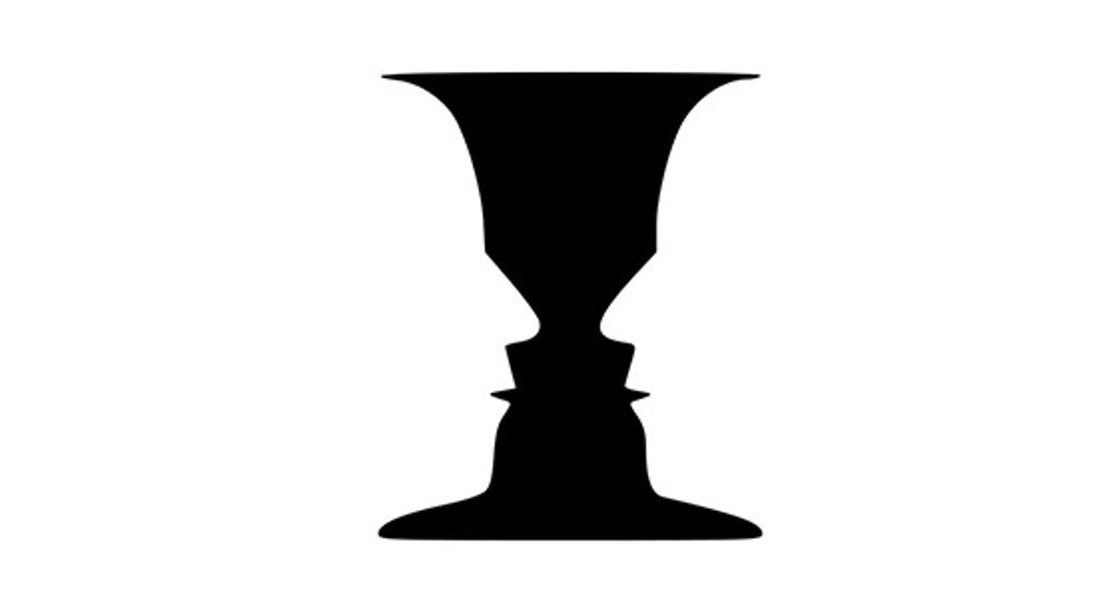
According to Gestalt psychologists, people’s minds innately tend to perceive patterns using five main categories—proximity, similarity, continuity, closure, and connectedness. The law of Pragnanz is closely related to these categories and serves as a guiding principle for visual perception. Whenever viewers—or users—see complex or highly intricate shapes in a design, their eyes simplify these. They do this by taking out the excess detail from the shapes to make a single, unified whole. This is a quick and automatic process—that’s because the human mind dislikes chaos and strives for order. Users don’t even have to think about what they’re doing or force the process. It just happens. For example, in the image below, the mind makes sense of the design to see black and white arms and hands in a figure-ground format where the background and foreground work together.
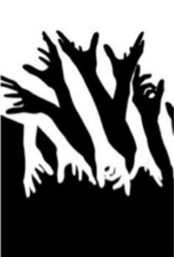
The law of Pragnanz here involves clever interplay between the figure and ground.
© Stephen Ziggy Tashi, Fair Use
The concept of Prägnanz was the brainchild of Max Wertheimer, a German psychologist. Wertheimer was one of the founders of 1920s’ Gestalt psychology, along with fellow psychologists Wolfgang Köhler and Kurt Koffka. The law of Prägnanz—with the umlaut, as it’s spelled in German—is one of the centermost principles of Gestalt psychology. In Wertheimer's 1923 paper on Gestalt theory, he discussed the idea of Prägnanz as being a fundamental principle of human perception. The exact definition and interpretation of Prägnanz, though, have evolved over time. That’s led to different understandings and descriptions of the concept as it relates to various fields. These fields include graphic design and product design—and they involve great attention to detail for UX and UI designers.
Despite these different definitions, the Gestalt school of thought proposes fundamental laws about how a person perceives objects—whatever medium is involved. The effects of some lines or curves are central to this school of psychology; and so is the point that an image is much more than the sum of its parts. What’s more, the mind’s lightning-fast perceptions of images mean that the Gestalt laws are timeless. So, the law of Pragnanz is a powerful truth in design—a vital frame of reference, a handy real-world “barometer” for aligning users’ expectations with a brand’s business goals, and a kind of tool that a design includes. This is also true of the principle of similarity, principle of proximity and principle of closure—as are the principle of uniform connectedness, principle of continuity, principle of closed region, and more.

Simple shapes, arranged well, conjure powerful imagery.
Author/Copyright holder: Clint. Copyright terms and licence: CC BY 2.0
How to Interpret the Law of Pragnanz
There may be varying interpretations of the law or principle of Pragnanz—but it’s generally understood as the law of Simplicity. The human mind has got a natural preference for order and organization over chaos. So, when people face visual stimuli, they tend to simplify complex shapes and forms into more recognizable and understandable patterns. This way of simplifying what they see lets them process information more easily and efficiently. That fact is extremely helpful when users come across a graphical user interface (GUI) for a product or service.
In UX design and UI design, the law of Pragnanz has a particularly special place. It suggests that simplicity and clarity are key elements in creating effective visual communications with strong visual hierarchy, use of spacing—or white space or negative space—and more. When designers present information clearly and concisely, they can make how their users retain information better—and so the design can engage more with its target audience. The law of Pragnanz is a reminder that designs should prioritize simplicity and steer well clear of unnecessary complexity.
“People ignore designs that ignore people.”
— Frank Chimero, Author of “The Shape of Design”
How to Apply the Law of Pragnanz in UX Design
Designers play a crucial role when they create interfaces that are intuitive, user-friendly, and visually appealing. The law of Pragnanz has strong implications for UX design. It acts as a guide for designers to make interfaces that are line with users at the level of how they tend to perceive things—naturally. When designers understand the law of Pragnanz—and use it well—they can fine-tune the individual elements and information architecture of digital products. From that, they can make interfaces that are easy to navigate, visually pleasing—and memorable. Here are the main points to keep in mind:
1. Go for Simplicity and Clarity in Interface Design
One of the key principles that comes from the law of Pragnanz is how important simplicity and clarity are in interface design. Users tend to arrive on a design with clear intentions as to what they want to do—so, they should be able to quickly and easily understand the UI’s purpose and functionality. So:
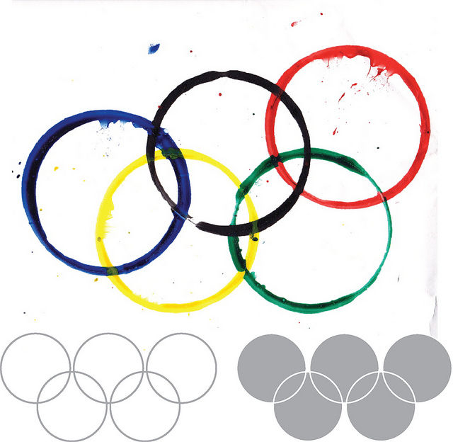
Use clear and concise visual elements—like simple shapes, minimal text and intuitive icons. Users usually have an easier time appreciating shapes that are less demanding when it comes to putting in—or not putting in—cognitive effort. For example, the circles of the Olympic Games are far more accessible to human eyes than abstract shapes would be. When a designer reduces visual clutter and complexity, they can make interfaces that are both visually appealing and easy for users to understand.

Google's search interface showcases the law of Pragnanz at work in UX design. The simplicity and clarity of the search bar involves its minimalistic design and prominent placement. Users can focus on the main task of entering their search queries. Note, the use of negative space and minimal distractions helps users understand and engage with the interface—and quickly.
© Google, Fair use
2. Prioritize Hierarchy and Visual Organization
Another aspect of the law of Pragnanz that designers can use to great effect is to optimize the hierarchy and visual organization. Users should be able to easily distinguish and prioritize different elements on the interface. So:
Use visual cues—like size, color and placement—to guide users’ attention. For example, highlight important information from using larger fonts or contrasting colors; present less important details in a more subdued way. For a website, be sure to avoid overcrowded navigation with too many menu items, complex dropdown menus and the like. Designers who establish a clear hierarchy can help users navigate the interface more effectively.

Spotify’s simple, highly organized UI lets users easily navigate the interface with bold headings and well-structured sections. Another thing is that the symmetry in the album covers and tiles helps keep users engaged.
© Spotify, Fair use
3. Make Sure that Consistency and Familiarity Feature
The law of Pragnanz also puts emphasis on how important consistency and familiarity are. Users are more likely to understand and engage with interfaces that conform to established design patterns and conventions. So:
Use familiar icons, menu structures and interaction patterns to fashion interfaces that feel intuitive and natural to users. Consistency in visual elements—such as color schemes and typography—is something that can also contribute to a cohesive and visually pleasing interface. Most importantly, don’t confuse users or make them pause to think about the design. Instead, let them take to it naturally and enjoy that all-important seamless experience.

IKEA’s clean and familiar layout enables users to find and view products easily.
© IKEA, Fair use
Further Examples of the Law of Pragnanz in UX Design
Some other examples from well-known brands that further illustrate how to apply the law—or principle—of Pragnanz in UX design best include these:
Apple
Apple is renowned for its minimalist and user-friendly interfaces. The design of their products—such as the iPhone and MacBook—follows the principles of simplicity and clarity. Clean lines, intuitive gestures and straightforward icons let users easily navigate and interact with the interfaces. Because Apple follows the law of Pragnanz, it means their products are visually appealing and user-friendly.

It's easy to follow what’s going on on Apple’s clean and intuitive website.
© Apple, Fair use
Dropbox
Popular cloud storage service Dropbox demonstrates how important hierarchy and visual organization are when it comes to UX design. The interface shows—most effectively—the hierarchy of folders and files. It achieves this through the use of clear visual cues—such as folder icons and file thumbnails. Users can easily navigate through their files and locate specific items, thanks to the consistent and intuitive visual organization.

The Dropbox interface is simple and uncluttered, making it easy to use.
© Dropbox, Fair Use
Remember, the law of Pragnanz can go a long way in helping create UIs that are both effective and user-friendly. After all, Pragnanz is one of the centermost Gestalt laws. So, it’s wise to use it to make design works that align with users' natural perceptual tendencies and confirm the results with usability testing. Ultimately, it will result in more successful—and more satisfying—user experiences overall.