The anatomy of type describes the visual elements that make up the letterforms within a typeface. Each letterform is made up of individual components (e.g., spine, stem, stroke). Type designers create typefaces using components — crucial parts that contribute to the overall appearance and legibility of a typeface.
“Typography is an art. Good typography is art.”
— Paul Rand, Art director and graphic designer whose logos include IBM
Learn more about what type is and what it means to design.
The Finer Points of Type
Your text plays a vital role in carrying the right message to your users. Not only are the words you choose important; the typographic choices you make such as font style and how you lay out your text onscreen are equally vital, too. So, it’s important to have an understanding of what goes into the type that you select. Be it for a website headline, a call-to-action button or a host of other functions, when you break type down to the anatomical level, you’ll have the building blocks to create a more legible and readable experience for your users. These are the terms to have in your “type dictionary” so you better understand how type is created and how to use it effectively in your work:
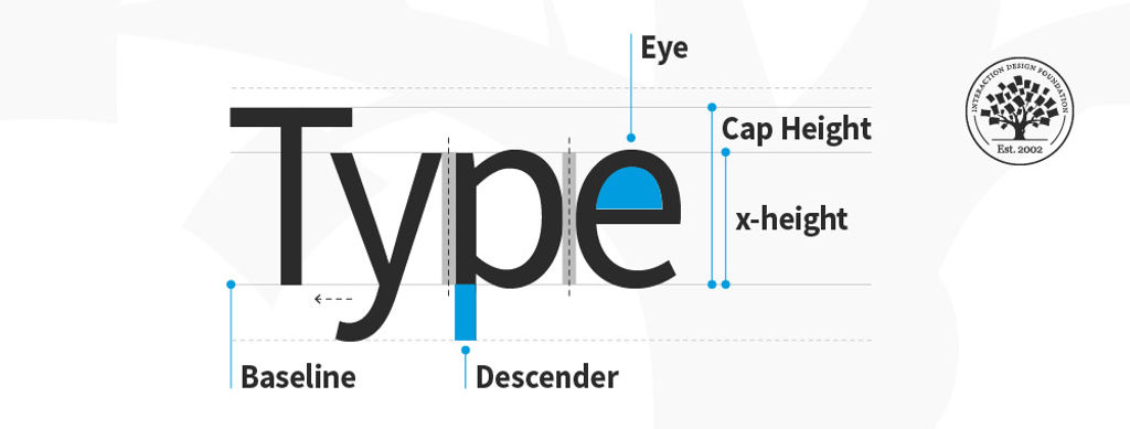
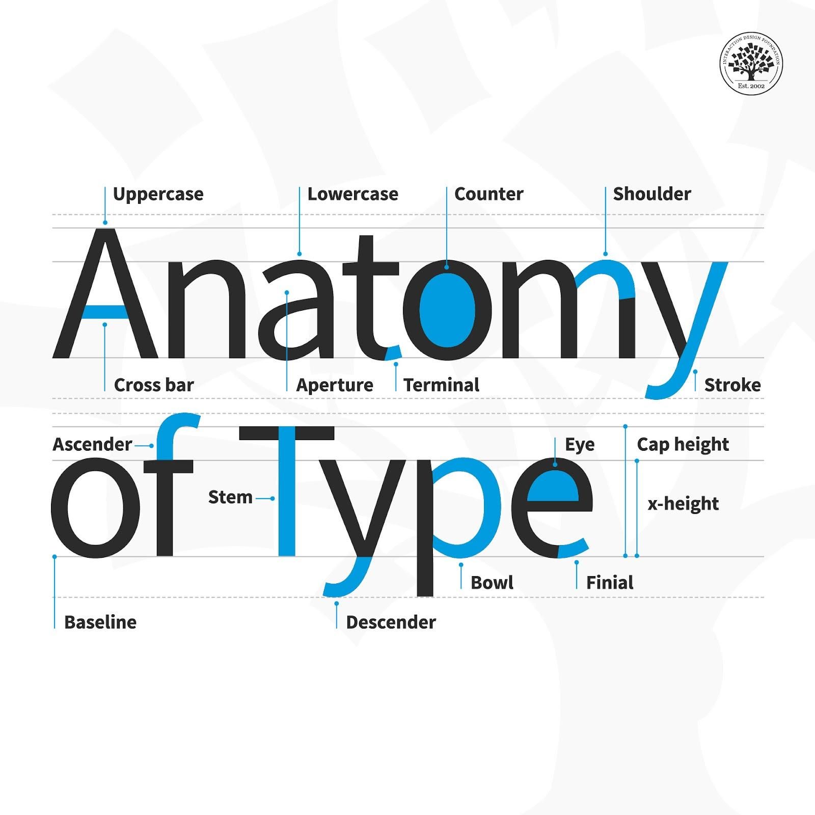
Aperture: The partially enclosed space of a letterform.
Ascender: An upward vertical stroke that extends beyond the x-height.
Baseline: The invisible line on which all letters rest.
Bowl: The generally round or elliptical forms which are the basic body shape of letters.
Cap height: The distance from the baseline to the top of the capital letter.
Counter: The white space enclosed by a letterform.
Cross bar: The horizontal stroke in letters.
Descender: A downward vertical stroke that extends beyond the baseline.
Dot: Also known as a tittle, is a small diacritic on a lowercase i or j.
Eye: The closed counter of a lowercase e.
Finial: A tapered or curved end on a letterform.
Ligature: Two or more letters tied into a single character.
Lowercase: A smaller form of letters in a typeface.
Shoulder: A curved stroke originating from a stem.
Spine: The main curved stroke of a lowercase or capital letter.
Stem: A main stroke that is more or less straight, not part of a bowl.
Serif: A stroke added to the beginning or end of one of the main strokes of a letter.
Small Capital: Short capital letters designed to blend with lowercase text.
Stroke: A straight or curved line that creates the principal part of a letter.
Terminal: A circular form at the end of the arm, leg or brow in letters.
Uppercase: A typecase containing capital letters.
x-height: The distance between the baseline and the height of the lowercase letter ‘x’.
Weight: The thickness of a font’s stroke.
© Daniel Skrok and Interaction Design Foundation, CC BY-SA 3.0
Design Tips for Type
Here are some helpful points to consider with the finer points of type:
Kerning – This is the adjustment of space between two individual letters. An example of bad kerning is when you use a font that has the letters so close together that (e.g.) what you typed as “kerning” shows up as “keming” (the letters get mashed together). It’s better to devote time to kerning with larger text and headlines (as opposed to smaller text and body copy). Also, if you kern one headline, be consistent and kern the others.
Tracking – This is the adjustment of space between a whole group of letters (rather than each one, as in kerning). You can fine-tune tracking by compacting or expanding this space to optimize your text.
Leading – This is the adjustment of vertical space between lines of text. While the default is typically fine, you can always fine-tune leading to make text extra-comfortable to read for your users.
Legibility – This refers to how easy it is to distinguish one letter from another in a particular typeface. This is the most fundamental consideration because you’ll know at a glance how legible your text is.
Readability – This refers to how comfortably users can read your text. Although they may be able to make out each letter, a poor choice of (e.g.) small caps use and font can slow users down or turn them off completely from proceeding with your design or product.
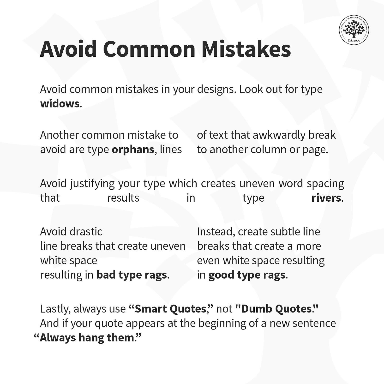
Here is a helpful list of common mistakes to avoid when designing with type.
© Daniel Skrok and Interaction Design Foundation, CC BY-SA 3.0
Overall, remember that the best designs are ones where users don’t stop to think about what you’re trying to show them. That’s why your typography not only has to complement the well-thought-out wording of your messages as well as the other design elements such as your images. Text needs to present well at both the micro and macro levels, too, hence why typographic knowledge is vital to design.


