Follow Ben Shneiderman’s 'Eight Golden Rules of Interface Design' if you want to design great, productive and frustration-free user interfaces. Apple, Google and Microsoft are among some of the highly successful companies whose well-designed products reflect Shneiderman’s rules. The characteristics derived from Shneiderman’s golden rules can be recognized in various user interface guidelines produced by corporate giants like the companies mentioned above. The visual embodiment of these rules is even more evident in the resulting popular interfaces they produce. This article will teach you to improve your work by integrating the 8 golden rules.
8 Golden Rules of Interface Design
Ben Shneiderman (born August 21, 1947) is an American computer scientist and professor at the University of Maryland Human-Computer Interaction Lab. His work is comparable to other contemporary design thinkers like Don Norman and Jakob Nielsen. In his popular book "Designing the User Interface: Strategies for Effective Human-Computer Interaction", Shneiderman reveals his eight golden rules of interface design:
Strive for consistency by utilizing familiar icons, colors, menu hierarchy, call-to-actions, and user flows when designing similar situations and sequence of actions. Standardizing the way information is conveyed ensures users are able to apply knowledge from one click to another; without the need to learn new representations for the same actions. Consistency plays an important role by helping users become familiar with the digital landscape of your product so they can achieve their goals more easily.
Enable frequent users to use shortcuts. With increased use comes the demand for quicker methods of completing tasks. For example, both Windows and Mac provide users with keyboard shortcuts for copying and pasting, so as the user becomes more experienced, they can navigate and operate the user interface more quickly and effortlessly.
Offer informative feedback. The user should know where they are at and what is going on at all times. For every action there should be appropriate, human-readable feedback within a reasonable amount of time. A good example of applying this would be to indicate to the user where they are at in the process when working through a multi-page questionnaire. A bad example we often see is when an error message shows an error-code instead of a human-readable and meaningful message.

Author/Copyright holder: Google, Inc. Copyright terms and licence: Fair Use
The Windows Media Player designers should have remembered Ben Shneiderman’s 3rd golden rule: Offer informative feedback. Poorly designed error messages often show an error-code that does not mean anything to the user. As a good designer you should always seek to give human-readable and meaningful feedback.
Design dialogue to yield closure. Don’t keep your users guessing. Tell them what their action has led them to. For example, users would appreciate a “Thank You” message and a proof of purchase receipt when they’ve completed an online purchase.
Offer simple error handling. No one likes to be told they’re wrong, especially your users. Systems should be designed to be as fool-proof as possible, but when unavoidable errors occur, ensure users are provided with simple, intuitive step-by-step instructions to solve the problem as quickly and painlessly as possible. For example, flag the text fields where the users forgot to provide input in an online form.
Permit easy reversal of actions. Designers should aim to offer users obvious ways to reverse their actions. These reversals should be permitted at various points whether it occurs after a single action, a data entry or a whole sequence of actions. As Shneiderman states in his book:
This feature relieves anxiety, since the user knows that errors can be undone; it thus encourages exploration of unfamiliar options.
Support internal locus of control. Allow your users to be the initiators of actions. Give users the sense that they are in full control of events occurring in the digital space. Earn their trust as you design the system to behave as they expect.
Reduce short-term memory load. Human attention is limited and we are only capable of maintaining around five items in our short-term memory at one time. Therefore, interfaces should be as simple as possible with proper information hierarchy, and choosing recognition over recall. Recognizing something is always easier than recall because recognition involves perceiving cues that help us reach into our vast memory and allowing relevant information to surface. For example, we often find the format of multiple choice questions easier than short answer questions on a test because it only requires us to recognize the answer rather than recall it from our memory. Jakob Nielsen, a user advocate who’s been called one of the “world’s most influential designers” by Bloomberg Businessweek has invented several usability methods including heuristic evaluation. Recognition over recall is one of Nielsen’s ten usability heuristics for interface design.
Learn How Apple Integrates Shneiderman’s 8 Golden Rules
Apple Inc., a large North American technology company is a great example of how designs reflecting Shneiderman’s eight golden rules can lead to successful products. The company has achieved great success in everything from their Macintosh to their mobile devices. They pride themselves in their consistent, intuitive and beautiful designs. Apple’s iOS Human Interface Guidelines, shared publicly in mid-2014, offers a glimpse into how their design team has been applying design principles like Shneiderman’s.
1. Consistency
“Consistency” and “Perceived Stability” are woven into the design of Apple’s Mac OS. The Mac OS Menu Bar is designed to contain consistent graphic elements regardless of whether it’s a version from the 1980’s or the 2010’s.

Author/Copyright holder: StockSnap.io Copyright terms and licence: CC0

Author/Copyright holder: StockSnap.io. Copyright terms and licence: CC0
The look ofMac OS over time. Mac OS Menu Bar stays consistent.
2. Shortcuts
As mentioned previously, Mac allows users to use a variety of keyboard shortcuts, commonly used examples include copy and paste (Command-C and Command-V), and taking screenshots (Command-Shift-3).

Author/Copyright holder: StockSnap.io. Copyright terms and licence: CC0
Mac allow users to forgo mouse-clicks by providing them with keyboard shortcuts.
3. Informative Feedback
A great example of visual feedback can be seen when a file becomes “highlighted” as the user clicks on a file on a Mac desktop. Another example is when the user drags a folder across the desktop, they can see the folder represented as physically being moved as they hold down their mouse.

Author/Copyright holder: Euphemia Wong. Copyright terms and licence: Fair Use
The ‘Learning’ folder becomes highlighted as the user clicks on a folder on a Mac desktop.
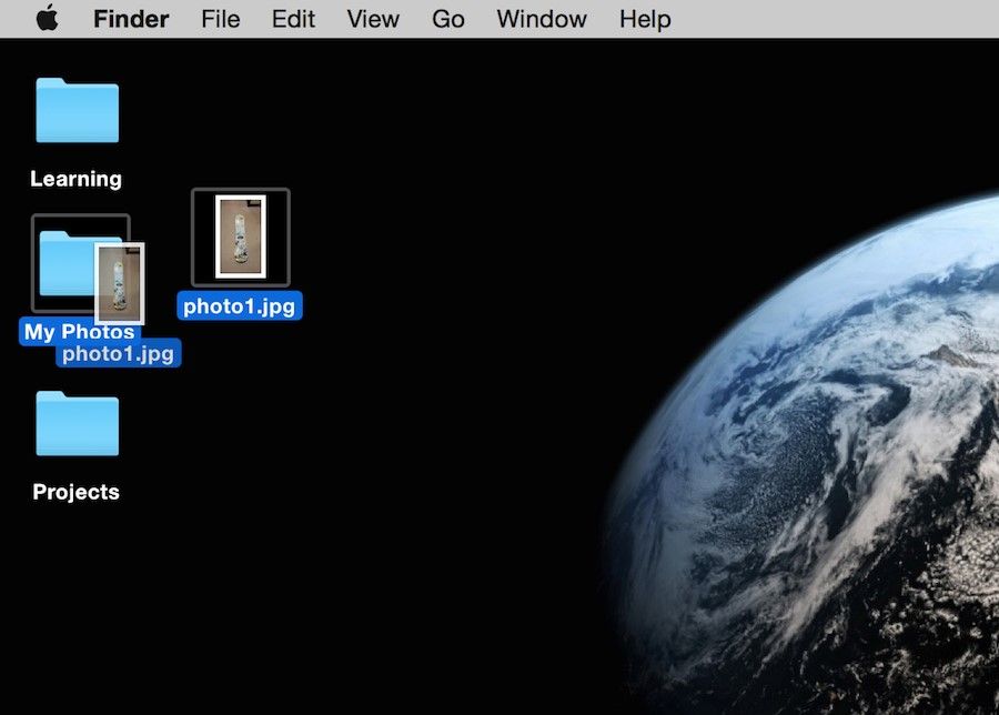
Author/Copyright holder: Euphemia Wong. Copyright terms and licence: Fair Use
The folder is represented as physically being moved as the user holds down the mouse and drags a folder across the desktop.
4. Dialogue
As the user installs software to the Mac OS, an informative screen shows what step the user is currently at in their installation.

Author/Copyright holder: Google, Inc. Copyright terms and licence: Fair Use
As the user installs the program “Parallels Desktop 9”, it shows that it is currently “copying files”.
5. Error handling
During software installation, users are gently alerted with an informative message if an error was made. It is important to recognize when to use smaller, less intrusive alerts and when to use greater alerts to warn a user depending on the severity of the error at hand. However, it is almost never acceptable to punish the user when errors are made, so be cautious and select the right tone and the right language when drafting an error message that will ultimately be read by your human-users. So don’t simply leave an error-code to “handle” it!

Author/Copyright holder: Google, Inc. Copyright terms and licence: Fair Use
A gentle error message is shown explaining to the user what was happening and why it was happening. It even goes further to reassure the user, telling them that they are in control (see ‘Support Internal Locus of Control’ below) by explaining that this is due to their own security preference choices.

Author/Copyright holder: Manutencaonet Blogspot. Copyright terms and licence: CC BY 3.0
A bad example by Windows displays an error message that uses the words “fatal” and “terminated”. Such negative, unfriendly words are sure to scare away most users!
6. Permit reversal of actions
When users make an error in providing information during the installation process, they are allowed to go back to the previous step instead of being “punished” by having to start over.

Author/Copyright holder: Euphemia Wong. Copyright terms and licence: Fair Use
The user can undo a previous action quickly and easily.
7. Support internal locus of control
Give users the power to choose whether to continue running the program or exit from it. Mac’s Activity Monitor allows the user to ‘Force Quit’ when a program has unexpectedly crashed.
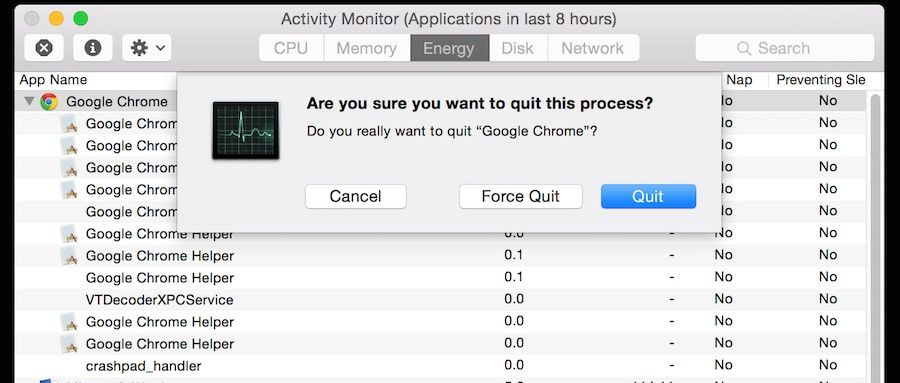
Author/Copyright holder: Euphemia Wong. Copyright terms and licence: Fair Use
The user is able to Quit or Force Quit a program if it crashes.
8. Reduce short-term memory load
As humans are only capable of retaining 5 items in our short term memory at one time, the Apple iPhone has stuck with allowing only 4 app icons to sit in the main menu area at the bottom of the screen. This decision does not only involve consideration of memory load but also considers consistency as well.

Author/Copyright holder: Pixabay. Copyright terms and licence: CC0
Great examples of how Apple implements the rules of consistency (1st rule) by displaying the same bottom menu across different versions of the iOS. This is also a great example of how Apple reduces short-term memory load (8th rule). As humans are only capable of retaining 5 items in our short term memory at one time, the Apple iPhone has stuck with allowing only 4 app icons to sit in the main menu area at the bottom of the screen, regardless of whether it’s the iOS 4 or the iOS 7.
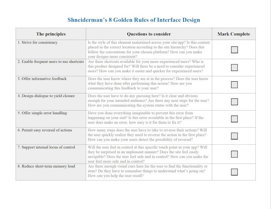
Worksheet: How You Can Apply Shneiderman’s 8 Golden Rules to Your Interface Designs
Your job as a designer is to make your user’s lives easier by creating intuitive, well-designed and frustration-free user interfaces. Applying Shneiderman’s eight golden rules of interface design will help you do just that. Here’s a worksheet for you to work through as you learn to apply these rules to your designs.
Download PDF here.
The Take Away
When you follow Ben Shneiderman’s 'Eight Golden Rules of Interface Design' you will design great, productive and frustration-free user interfaces just like Apple, Google, and Microsoft. From Macs and PCs to mobile devices or virtual reality and any other interactive technologies to be invented in the future, as long as your designs involve interaction between humans and an interface, these eight golden rules are paramount in the design process and not to be missed. To get started, go ahead and use the attached worksheet to learn to apply these rules to your work.
Where To Learn More:
Discover more information about Ben Shneiderman’s 8 Golden Rules.
Read more about Jakob Nielsen’s 10 Usability Heuristics.
Check out some information on iOS Human Interface Guidelines from Apple.
References
Author/Copyright holder: Marc Smith. Copyright terms and license: CC BY 2.0