Steve Jobs treated every presentation like a user journey. He shaped the emotional pacing with the precision of a product designer. If you think presenting is about speaking, you’re missing the deeper craft: Guiding someone’s experience. He made people see the world through his eyes. The power of his presentations came from that simple intention: Meaning first, performance second. And this is a skill you can easily master.
The lights dim. A black turtleneck steps into the spotlight. The audience, thousands deep, holds its breath. On the screen, a single word appears: “Hello.” A pause. Then applause.
Steve Jobs hadn’t said anything yet, but everyone in that room already felt something; he had designed the moment.
What makes a moment like that unforgettable isn’t technology or theatrics. It’s design. Every detail has been thought through: How the word appears, how long the silence lasts, where attention will rest. The scene feels effortless, yet every second has purpose. This is the essence of clarity. The deliberate act of making ideas visible, understandable, and undeniable.
Most presentations are built to show information when they should be built to create meaning. The difference lies in intention. Clarity has power. It turns complexity into curiosity, and curiosity into belief. It makes people stop scrolling, stop doubting, stop thinking about their next meeting.
That's what Jobs achieved in those moments, and what you can master too. Jobs once said, "Simple can be harder than complex." That truth applies to every presentation you'll ever give. Simplicity isn't the absence of effort; it's the result of clarity, empathy, and design. Because the real goal of presenting is to make others see what you see.
You don't need to be Steve Jobs to think this way. In this video, Morgane Peng, Head of Product Design & AI Transformation at Societe Generale, reveals the real reason moments like Steve Jobs stepping into the spotlight feel electric.
Design Your Presentation Like a Product
Jobs treated every presentation as carefully as a new product launch. Before unveiling the first iPhone, he rehearsed for days, sometimes weeks, editing transitions, practicing pauses, and even timing his delivery to shape when the audience would applaud. It wasn’t vanity. It was design.
He believed, "Design isn't just what it looks like and feels like. Design is how it works." That philosophy applied to his slides as much as to his devices.
© Giphy, Fair Use.
Think of your presentation like a user experience. You aren’t delivering slides; you’re guiding someone through an emotional and cognitive journey. Every sentence, image, and silence is a touchpoint.
Ask yourself:
Who's this experience for?
What do they need to feel before they can agree?
Where might confusion interrupt understanding?
What should they walk away believing?
When your presentation works, people stop noticing how well you spoke. They start seeing what you mean.
When a product works well, you forget the design and focus on what it allows you to do. The same is true for communication. When a presentation is well designed, the audience stops noticing slides, phrasing, or gestures. They enter a flow of comprehension, the way a user feels when a product “just works.”
Jobs built his talks like prototypes: Tested, refined, stripped of clutter until nothing remained but the essence. A product that works well makes users feel capable.
A presentation that works well does the same. It leaves people thinking, “I understand this. I can use this. I believe in this.”
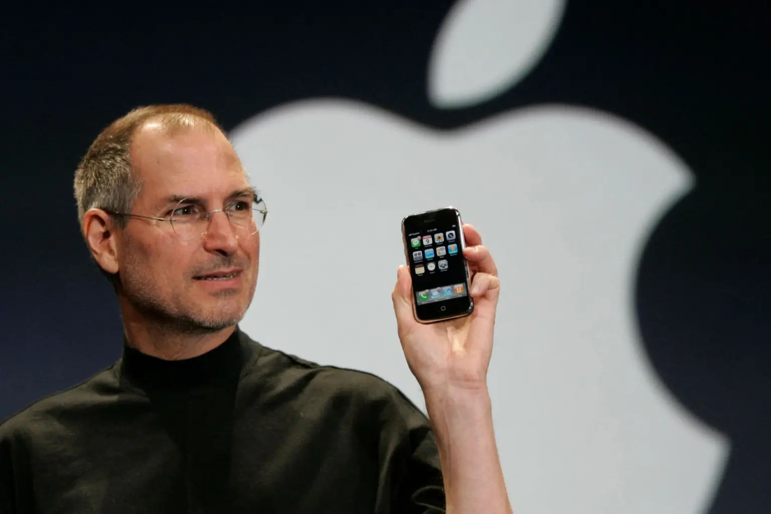
Example: First iPhone Presentation
In 2007, Steve Jobs introduced the first iPhone. He walked the audience from curiosity to belief with the precision of a designer mapping a user journey. Let’s see how he did it.
New York Post, Fair Use
Who is using this experience?
Jobs knew his audience wasn’t full of engineers. It was filled with everyday people tired of clunky phones. He stripped away jargon and met them where they were: Curious, but cautious.
What do they need to feel before they can agree?
People resist new ideas until they feel the benefit. Jobs didn’t push logic; he built excitement. “Today, we’re introducing three revolutionary products… They’re not three separate devices. They’re one device.”
The moment he said it, the room erupted. Wonder replaced doubt.
Where might confusion interrupt understanding?
Touchscreens were unfamiliar, even suspect. So, Jobs showed, rather than told. He pinched, scrolled, and tapped in real time. The demo turned confusion into intuition.
What should they walk away believing?
By the end, no one thought they’d seen a new phone. They believed they’d seen the future. That belief wasn't persuasion; it was design.
When your presentation works, people stop thinking about how well you spoke. They start seeing what you mean.
Speak to Humans, Not Slides
Steve Jobs had a gift for translating technology into language anyone could feel. In 2001, Jobs walked on stage holding something barely visible in his hand. He could have said, “This device has five gigabytes of storage.” Instead, he smiled and said, “A thousand songs in your pocket.”
That single line did more than describe a product. It invited people into a new reality: Your entire music collection, everywhere you go. No CDs. No limitations. Just freedom. He made people feel what life would be like before they ever held the iPod.
Most professionals today bury their brilliance under jargon. They believe complexity signals expertise, when in fact it signals distance. Clarity is the clearest proof of mastery, not the opposite of intelligence.
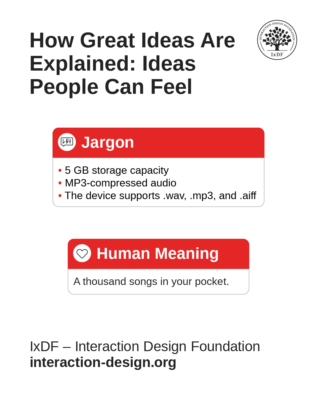
© Interaction Design Foundation, CC BY-SA 4.0
Jobs invited his audience into a world where his solutions made their lives better, easier, more meaningful. Here’s how to do the same.
1. Step Out of Your Role and into Their World
Jobs never described the iPod as an engineer would. He understood that people weren’t buying a hard drive; they were buying possibility.
Before you present, ask: If I weren’t the expert, how would this make sense to me? If your audience can’t picture it, they can’t believe it.
Next time you prepare a presentation, read it out loud to someone outside your field. If they understand it immediately, you’re ready. If they frown, simplify again. The real purpose of your work lies in uncovering and sharing meaning.
2. Replace Abstraction with Images People Can Feel
When Jobs said “a thousand songs in your pocket,” he was painting a picture. You could almost feel the weight of that pocket, the convenience, the freedom. That’s what makes ideas memorable, the sensory experience behind the words.
Instead of saying “optimized performance,” paint the picture with something vivid and immediate, like “faster than flipping a page.” People remember what they can imagine.
3. Use Rhythm, Not Rush
The silence after Jobs’ sentence was as powerful as the words themselves. He paused, waited, let the image land. That stillness gave the idea gravity. When you slow down, you give your audience time to understand, and more importantly, to feel.
The Most Powerful Person in the Room Is the One Who Can Tell the Story
When Steve Jobs introduced the MacBook Air in 2008, he didn’t begin with specifications. He didn’t talk about processors or display resolutions. He walked on stage holding a simple manila envelope. The audience waited, puzzled. Then, slowly, he pulled the thinnest laptop ever made out of the envelope.
No numbers. No slides. Just a story in motion.
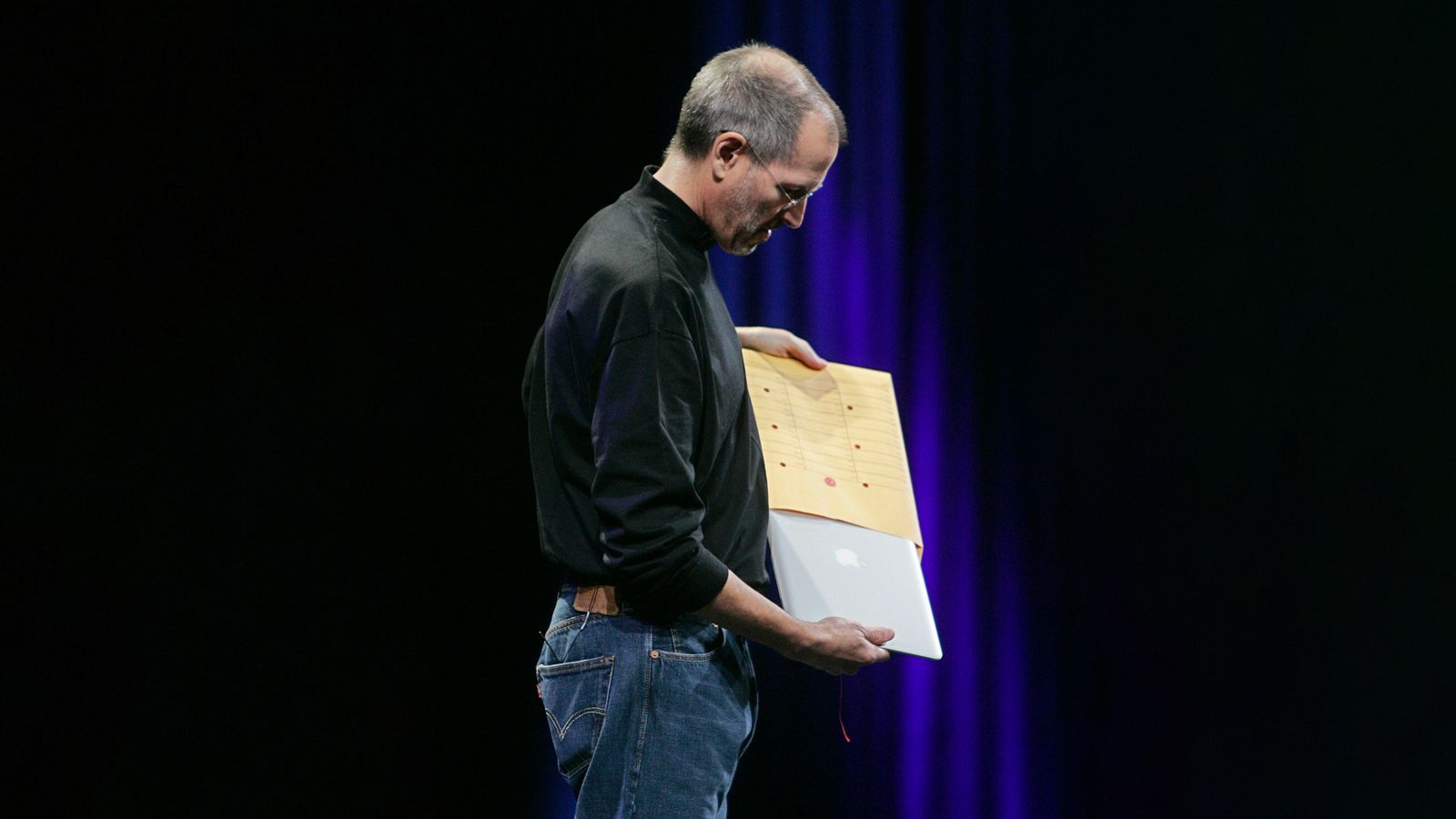
© Appleking, Fair Use.
That one gesture told the entire narrative: Simplicity, portability, surprise. Everyone in the room could already picture the vision, no explanation needed.
Storytelling in presentations works the same way. A well-crafted story brings the message to life and makes it feel real.
Here’s how to tell stories that carry power.
1. Start with a World Your Audience Already Understands
Every story begins with context: The world as it is before your idea arrives. Before revealing the MacBook Air, Jobs described the problem: Laptops were getting smaller but were still bulky and heavy. By reminding people of their everyday frustration, he made them emotionally ready for change. When you present, begin in a place your audience already believes in. You can’t take them somewhere new if you don’t first meet them where they are.
2. Build Tension with Contrast
The strongest stories create a gap between what is and what could be. Jobs didn’t immediately show the Air. He built tension by describing trade-offs: How lightness usually meant less power. Then came the twist: “What if a laptop could be powerful and unbelievably thin?” The envelope appeared, and that question answered itself. When you introduce your solution, let the tension breathe. Curiosity is the bridge to belief.
3. Resolve with Transformation, Not Information
Facts close the mind; transformation opens it. Jobs didn’t end with specs; he ended with meaning. “This,” he said, holding the Air above his head, “is the world’s thinnest notebook.” The statement wasn’t about metal or measurements: It was about what was now possible. Your presentation should end the same way: Not with a summary, but with a shift. What does your idea change in the world your audience knows?
A great story gives your presentation a pulse: anticipation, revelation, resolution. That rhythm is what people remember long after the slides disappear.
Jobs once said that the storyteller sets the vision, values, and agenda of an entire generation.
“The most powerful person in the world is the storyteller.”
— Steve Jobs
That’s true for every room you enter. The story you tell determines what others believe is possible.
Your Voice Is the Real Interface
Jobs once said, "It’s in Apple’s DNA that technology alone is not enough." He knew that what connects humans isn't hardware, but tone, warmth, and timing. The same is true for presenting. Your voice is your interface. It translates your ideas into emotion.
Try this: Slow down by half when explaining something important. Lower your tone slightly at the end of a key point. Then, pause.
Jobs mastered silence. Before announcing the first iPhone, he said, “Today, Apple is going to reinvent the phone.” Then he stopped. He let the room inhale.
In that pause, anticipation became electricity.
Your silence is the whitespace of your message. It creates focus and grace.
Your tone carries shape. Your pauses create texture. Your silence sets boundaries around meaning. Most people think of voice as performance, but it’s closer to architecture. Every rise and fall, every held breath, creates space for understanding.
The next time you speak, think like a designer, not a performer.
Ask yourself:
What rhythm fits the mood of my message?
Where does the audience need air to process what I’ve said?
When should I lower my tone, not to sound serious, but to sound sincere?
You already do this in everyday conversation. You pause to let a friend finish a thought, soften your voice when someone needs reassurance, or slow down when the topic matters. Your instinct for rhythm, tone, and empathy is already built in. So why does it vanish the moment you step in front of an audience?
Because presenting makes us self-conscious. We start performing instead of connecting. We forget that a presentation is still a conversation; it's just one where more people are listening.
Innovation in Presenting Means Saying No to a Thousand Slides
© Interaction Design Foundation, CC BY-SA 4.0
Jobs once told his team, "Innovation is saying no to a thousand things." You could see that belief every time he presented. No cluttered graphics. No bullet storms. No walls of text. Just one image, one phrase, one truth at a time.
The slides behind him were more than decoration. They were silence made visible; space that kept the audience focused on meaning instead of noise.
When you simplify, you force yourself to think. What’s essential? What truly moves the audience forward?
A great presentation isn’t a data dump. It’s an act of editing. The human brain processes more deeply when you give it less to fight through.
Most people fill slides to feel safe. More data. More context. More proof. But safety isn't clarity. It’s camouflage. When you strip your presentation to its essentials, you expose yourself a little. You’re forced to stand in the open with your ideas. That’s vulnerable but it’s also magnetic. The audience finally has space to think, to feel, to engage.
The discipline of subtraction doesn’t only apply to visuals. It applies to words, examples, and even time.
Ask yourself before every presentation:
What can I remove without losing the meaning?
What would happen if I cut this slide, this paragraph, this phrase?
What if the silence between points did more than another chart ever could?
When you practice restraint in how you communicate, something remarkable happens: People stop feeling like they’re being lectured and start feeling like they’re discovering.
When Your Message Is Clear and Simple, It Just Works
Jobs often ended demonstrations with a quiet smile and three words: "It just works." That line went beyond marketing; it was a statement about integrity. The product didn’t need to shout. Its clarity spoke for itself.
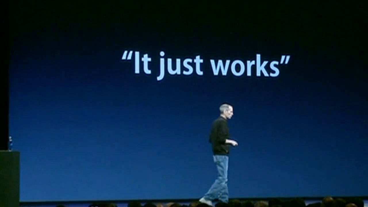
A great presentation is the same. It should “just work.” Not because you rehearsed it to perfection, but because you designed it to be human.
When you present with clarity, empathy, and focus, you’re translating complexity into connection. You don’t need the stage, the lights, or the turtleneck. You just need to make people see what you see.
That’s how you make your ideas matter. That’s how you become remembered as a communicator who cared enough to be understood.
Jobs’ genius wasn’t simplicity for its own sake. It was simplicity that served meaning. Each pause, each phrase, each visual existed to make something invisible feel tangible. He made understanding look easy because he did the hard work of removing everything that wasn’t necessary.
You can do the same. Clarity emerges from discipline, never as a random gift. It’s learning to edit until nothing stands between your idea and their understanding. Presenting, at its best, isn’t about you at all. It’s about what happens in the listener’s mind when your words arrive. The more space you give them to think, to feel, to connect, the more powerful your message becomes.
So design your presentations the way Jobs designed his products: With empathy, patience, and care. Speak with the same intention you bring to your craft. Let silence work. Let structure carry the story.
Because when you do, it starts sounding true. And when truth is clear, it doesn’t need to shout. It just works.
The People Who Are Crazy Enough to Think They Can Change the World... Usually Have a Deck Ready
When Steve Jobs said these words “The people who are crazy enough to think they can change the world are the ones who do,” he wasn’t talking about dreamers.
He was talking about doers, the kind of people who believe that ideas matter only when they can be shared. Changing the world begins with powerful communication, long before any invention takes shape. Every movement begins with a conversation that makes someone stop, think, and say, “I see it now.”
The iPhone, the Mac, the iPod, each one began as a story told clearly enough for others to believe in. Through his presentations, Jobs instilled deep belief systems around his products. He made complex technology sound inevitable, even obvious, by framing it inside a story about progress.
And that’s what powerful presenters do. They make the future sound possible. Most people underestimate how much influence a well-crafted presentation can carry. They think they’re just showing work. In reality, they’re shaping vision.
Every deck you create, every update you deliver, every sentence you refine has the potential to shift how someone sees their world. It might not be global, but it can be deeply human, a better process, a new idea, a small act of alignment that changes how a team moves forward.
Jobs believed that design could change lives. The same belief applies to communication. When you design clarity, you give people something to act on. So, have your deck ready. Not because you need to pitch constantly, but because you should always be prepared to make meaning visible. The world doesn’t change when someone has an idea. It changes when someone can explain that idea clearly enough for others to act.
You don’t need to be famous, or flawless, or fearless. You just need to be ready to speak when it matters, and to speak with clarity.
Because those who are brave enough to share what they believe, and disciplined enough to make others understand it, are the ones who move things forward.
And sometimes, the only difference between an idea that dies and one that changes everything is a single, well-told story.
The Take Away
Clarity, not charisma, is what made Steve Jobs unforgettable, and it’s what will make you fast-track your career. The heart of his genius lived in design, giving life to every detail. Every presentation he gave was built like a product: Empathetically, intentionally, and with ruthless simplicity. He knew that understanding is the real currency of influence.
When you build empathy before you build slides, when you replace jargon with human language, when you let silence speak as loudly as words, you turn communication into connection.
The power of your presentation doesn’t live in your voice, your slides, or your confidence; it lives in what people feel and remember after you finish. Great presenters, like great designers, aim to make others see.
So, the next time you prepare to speak, think less about performance and more about design. Edit until your message breathes. Focus until your story moves. And remember: The world doesn’t need another polished presentation, it needs ideas that work, ideas that move, ideas that just make sense.
References and Where to Learn More
Storytelling is one of the core skills you’ll master in our course Present Like a Pro: Fast-Track Your Career.
Read about why You’re Not Bad at Presenting; You Just Haven’t Mastered the Right Way (Yet)
Discover How to Find Your Voice: Speak with Confidence and Clarity.
Hero image: © The Interaction Design Foundation, CC BY-NC-SA 4.0.